Royals
‘Horrible’ portrait of Kate Middleton slammed by fans: ‘Is this a joke?’
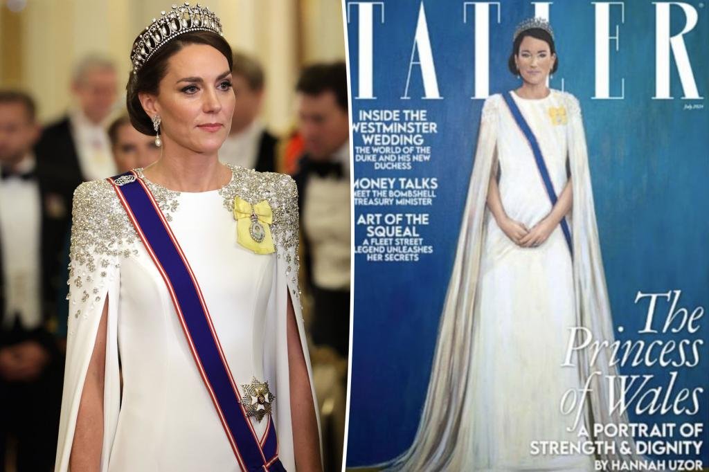
A new portrait of Kate Middleton drew a mixed reaction from royal fans after its unveiling on Wednesday.
The controversial piece, painted by British-Zambian artist Hannah Uzor, was featured on Tatler magazine’s July 2024 cover as part of a series of portraits of the royal family.
Uzor appeared to take inspiration from the Princess of Wales’ outfit at a November 2022 state banquet — the first under King Charles’ reign.
Middleton, 42, wore a white floor-length gown with crystal-covered shoulders and billowing sleeves to the event.
She added even more sparkle with the Lover’s Knot tiara, Princess Diana’s South Sea pearl-and-diamond drop earrings and Queen Elizabeth’s pearl bracelet.
The mom of three completed the look with a crossbody blue sash and yellow pin, which was all depicted in Uzor’s portrait.
While Middleton, who is currently battling cancer, did not sit for the photo, Uzor sifted through thousands of photos to capture her likeness.
“I spent a lot of time looking at her, looking at her pictures, watching videos of her, seeing her with her family, seeing her in diplomatic visits, seeing her when she’s rowing or visiting children in hospice,” Uzor said in a video posted to Tatler’s Instagram.
“It’s been really interesting for me to get a sense of who she is,” the artist added.
While the outlet described the finished piece as a portrait of “strength, dignity and courage,” many of their Instagram followers used much different adjectives.
“Disappointing portrait … our POW is far more beautiful ..😟,” one user wrote, to which another agreed, “A very poor portrait which totally fails to represent the beauty and elegance of the Princess of Wales.”
“What a horrible portrait for a beautiful Woman,” a third added.
Meanwhile, others called the image “laughable,” asking if the outlet was “joking.”
“This does not look like the PoW at all. I thought it was a joke at first,” someone else wrote.
“This isn’t great is it? Is this a spoof?” another asked.
However, there were others who were more supportive of the portrait.
“This is stunning. These comments are wild. The energy captured is exquisite,” one shocked follower remarked.
“So Beautiful,” another user commented.
The uproar came just a week after another artist, Jonathan Yeo, faced criticism for his artistic portrayal of King Charles III.
The piece, which was Charles’ first official portrait as monarch, was heavily scrutinized for its intense red background and overall tone — which some thought looked like the royal was in “hell.”
However, Yeo later defended his work, saying he used the bright color to “distract” from the king’s already vibrant red uniform.
On his website, the artist also explained that he wanted to put “greater emphasis on capturing the character and essence” of Charles in a more modern way.
“The vivid colour of the glazes in the background echo the uniform’s bright red tunic, not only resonating with the royal heritage found in many historical portraits but also injecting a dynamic, contemporary jolt into the genre with its uniformly powerful hue / providing a modern contrast to more traditional depictions,” he wrote.
Read the full article here


Euro 2024 Here come the WAGs – England players’ other halves arrive ahead of Serbia match

Elin Hilderbrand Steps Into New Waters After Retiring From Writing Beach Reads (Exclusive)

Rihanna Has the BEST Reaction to Baby No. 3 Rumors (Exclusive) | E! News

‘Love Is Blind’ Promises ‘Diligent’ Casting Process After Fans Question How Trevor Got Into the Pods

Brooklyn Beckham and Nicola Peltz ‘heartbroken’ after ‘unexpected’ loss

Teresa Giudice shares text she recently sent Dina Manzo after rumored falling out

Carrie Underwood falls off stage at South Carolina concert in ‘massive downpour’

Matthew McConaughey marks 12th wedding anniversary with wife Camila with sweet PDA snap

Christopher Reeve’s 3 Children: All About Matthew, Alexandra and Will

Donny Osmond’s 5 Children: All About His Sons
Elin Hilderbrand Steps Into New Waters After Retiring From Writing Beach Reads (Exclusive)
Rihanna Has the BEST Reaction to Baby No. 3 Rumors (Exclusive) | E! News

Who Is Patton Oswalt’s Wife? All About Meredith Salenger

Gayle King Shares TMI Confession About Oprah's Recent Hospitalization | E! News

Nia Long Dishes on ‘Huge Responsibility’ of Playing ‘Iconic’ Katherine Jackson in Upcoming Michael Jackson Biopic (Exclusive)
-
 TV6 days ago
Teresa Giudice shares text she recently sent Dina Manzo after rumored falling out
-
 Entertainment6 days ago
Christopher Reeve’s 3 Children: All About Matthew, Alexandra and Will
-
 Entertainment6 days ago
Donny Osmond’s 5 Children: All About His Sons
-

 TV7 days ago
Christine Quinn reunites with ‘Selling Sunset’ cast amid Christian Richard divorce
-
 Entertainment6 days ago
Carrie Underwood falls off stage at South Carolina concert in ‘massive downpour’
-
 Movies6 days ago
Matthew McConaughey marks 12th wedding anniversary with wife Camila with sweet PDA snap
-

 TV7 days ago
‘Below Deck’ alum Captain Lee Rosbach reveals why his friendship with Carl Radke ended: ‘It bothers me’
-

 Videos6 days ago
Selma Blair's HEALTH UPDATE Amid Multiple Sclerosis Remission: “I'm Feeling Really Well” | E! News